诗歌诗句垂直排版css
需求:
上一篇小编写了首打油诗 暴风雨 ,很多小伙伴咨询如何排版的,其实很简单运用了一个css属性 writing-mode,这个属性在国际化中经常用到,因为有的海外国家的阅读和书写习惯跟我们不一样,嗯,跟我们古文的排版有点像,也算是巧合了,有了这个属性可以运用.
上一篇小编写了首打油诗 暴风雨 ,很多小伙伴咨询如何排版的,其实很简单运用了一个css属性 writing-mode,这个属性在国际化中经常用到,因为有的海外国家的阅读和书写习惯跟我们不一样,嗯,跟我们古文的排版有点像,也算是巧合了,有了这个属性可以运用.
原生的checkbox样式很单一,常常需要自定义样式
使用label关联input[checkbox],input隐藏,label覆盖input显示,设置label选中前后的样式即可。
HTML:
<div class="cbk-tubiao-con">
  <input id="pro-1" class="cbk-tubiao" type="checkbox" />
  <label for="pro-1"></label>
</div>
CSS:
/*自定义checkbox*/
.cbk-tubiao-con>label:before {
    margin-top:-2px;
}
.cbk-tubiao-con {
    height:20px;
    position:relative;
}
.cbk-tubiao-con>label {
    line-height:20px;
}
.cbk-tubiao-con>label:before {
    box-sizing:border-box;
    display:inline-block;
    content:"";
    width:24px;
    height:24px;
    border-radius:50%;
    background:url("http://p31rkzyhv.bkt.clouddn.com/unchoose.png") no-repeat;
    background-size:100%;
    position:absolute;
    top:0;
    left:0;
}
input.cbk-tubiao {
    width:24px;
    height:24px;
    visibility:hidden;
    vertical-align:middle;
}
.cbk-tubiao-con input.cbk-tubiao:checked + label:before {
    content:"";
    background:url("http://p31rkzyhv.bkt.clouddn.com/choose.png") no-repeat;
    text-align: center;
}
把css中的background换成自己的图片即可
我们用react演示
tsx组件
import React, { useState } from "react";
import styles from "./Checkbox.module.css";

interface Props {
  className?: string;
  onChange?: (state: boolean) => void;
  style?: React.CSSProperties;
  children?: React.ReactNode;
  checked?: boolean;
}

export const Checkbox: React.FC<Props> = ({
  className,
  onChange,
  children,
  style = {},
  checked,
}) => {
  let [checkedState, setCheckedState] = useState(checked || false);

  const handleChange = () => {
    onChange(!checkedState);
    setCheckedState(!checkedState);
  };

  return (
    <label className={styles.container}>
      {children}
      <input type="checkbox" onChange={handleChange} checked={checkedState} />
      <span className={styles.checkmark}></span>
    </label>
  );
};
对应的样式
/* The container */
.container {
  position: relative;
  padding: 0 1em 0 1.4em;
  cursor: pointer;
  font-size: 16px;
  -webkit-user-select: none;
  -moz-user-select: none;
  -ms-user-select: none;
  user-select: none;
}

/* Hide the browser's default checkbox */
.container input {
  position: absolute;
  opacity: 0;
  cursor: pointer;
  height: 0;
  width: 0;
}

/* Create a custom checkbox */
.checkmark {
  position: absolute;
  top: 0;
  left: 0;
  height: 1.1em;
  width: 1.1em;
  background-color: gray;
}

/* On mouse-over, add a grey background color */
.container:hover input ~ .checkmark {
  background-color: lightgary;
}

/* When the checkbox is checked, add a blue background */
.container input:checked ~ .checkmark {
  background-color: #2196f3;
}

/* Create the checkmark/indicator (hidden when not checked) */
.checkmark:after {
  content: "";
  position: absolute;
  display: none;
}

/* Show the checkmark when checked */
.container input:checked ~ .checkmark:after {
  display: block;
}

/* Style the checkmark/indicator */
.container .checkmark:after {
  left: 0.4em;
  top: 0.1em;
  width: 0.3em;
  height: 0.7em;
  border: solid white;
  border-width: 0 0.1em 0.1em 0;
  -webkit-transform: rotate(45deg);
  -moz-transform: rotate(45deg);
  transform: rotate(45deg);
}
需求:常见的用于登陆验证中,输入电话号码后点击“获取验证码”,开始60s倒计时,这段时间内获取验证码按钮无法点击,60s倒计时结束后,方可“重新获取”。

解析:使用setTime定时器,每秒刷新一次。 Continue reading…
等待加载网页,上传文件均需要进度条,初步选用HTML5 自带progress标签+JS定时器实现一个固定时间加载完成的进度条。
HTML:
<progress id="load" ></progress>
未加任何样式,进度条在左右跳动,可用作持续加载文件或网页。
HTML:
<progress max="100" value="0" id="load" ></progress>
CSS:
progress{
background:green;
border:1px solid #000;
appearance: none;/*设置iOS下清除灰色背景*/
-webkit-appearance: none;
}

/*设置进度条颜色*/
::-ms-fill{
background:red;
}
::-moz-progress-bar{
background:red;
}
::-webkit-progress-value{
background:red;
}

/*设置进度条背景颜色*/
::-webkit-progress-bar{
background:green;
}
JS:
/*定时器,value到达100即停止*/
var pg = document.getElementById("load");
var setpg = setInterval(function(e){
if(pg.value != 100){
pg.value++;
}else{
clearInterval(setpg);
}
},80);
PS :这里不能设置border-radius圆角效果,不需要圆角样式的,可以修改颜色匹配项目即可。
需要圆角样式的,往下看看自定义progress
解析:使用两层DIV嵌套,外层可设置边框、背景,内层设置进度条的渐变、动画。
不熟悉动画的同学先移步 CSS:animation 简单动画效果
效果:
HTML :
<div id="out-progress">

<div id=in-progress></div>

  </div>
CSS:
#out-progress{
width:100%;
border:1px solid #ccc;
border-radius:10px;
background:#EEE8AA;
height:20px;
padding:1px;
}
#in-progress{
width:100%;
height:100%;
border-radius:10px;
background:-webkit-linear-gradient(left,#FFEFDB,#FF8247);
-webkit-animation:loadpg 5s 1s linear infinite;/*实际应用中infinite改为1即可实现一次性加载到头后停止*/
}
@keyframes loadpg{
0%{
width:0%;
}
100%{
width:100%;
}
}
上下循环移动的动画效果:
Continue reading…
问题:需要两个i标签并排显示,中间无间隙,但是在margin:0;padding:0设置好了的情况下,仍然有间隙
HTML:
<i class="first"></i>
<i class="second"></i>
原因分析:把i (或者span之类的) 写在不同行就会出现间隔,
解决方法:应把两个i写在同一行
HTML:
<i class="first"></i><i class="second"></i>
 i_无间隔
i_无间隔
参考:http://blog.csdn.net/clarkt/article/details/46363909
布局:ul中4个li标签,以中间为轴对称
分析:浮动,50%,box-sizing,padding
注意:要实现分块区域对称,li不能加margin,会被挤下来,应加上padding后设置a元素背景白色,即与大背景分离
 css 对称分布效果
CSS:
 .nav_two li{float:left;
    width:50%;
    -webkit-box-sizing: border-box;
    -moz-box-sizing: border-box;
    -ms-box-sizing: border-box;
    --box-sizing: border-box;
    box-sizing: border-box;opadding:8px;}

.nav_two li a{display:block;
    background:#fff;
    height:65px;
    width:100%;
    -webkit-box-shadow: -1px 1px 1px rgba(0,0,0,0.3);}
效果:
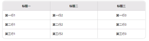 表格table
HTML:
<section>
    <table>
        <tr>
            <th>标题一</th>
            <th>标题二</th>
            <th>标题三</th>
        </tr>

        <tr>
            <td>第一行1</td>
            <td>第一行2</td>
            <td>第一行3</td>
        </tr>

        <tr>
            <td>第二行1</td>
            <td>第二行2</td>
            <td>第二行3</td>
        </tr>

        <tr>
            <td>第三行1</td>
            <td>第三行2</td>
            <td>第三行3</td>
        </tr>
    </table>
</section>
CSS :
section table{
width:90%;
margin:5px auto;
border-collapse: collapse;
border-spacing: 0;
overflow:hidden;
border:1px solid #CCCACC;
border-radius:10px;
-webkit-box-shadow:0 0 4px rgba(0,0,0,0.3);}

section table th{
padding:10px 15px;
border-right:1px solid #CCCACC;
background:#E9E7E9;
text-shadow: 1px 1px 1px #fff;}

section table td{
padding:10px;
border-right:1px solid #CCCACC;
border-top:1px solid #CCCACC;}

section table td:last-child{
text-align:center;
border-right:none;}
推荐使用
body,div,span,a{
padding:0;
margin:0;
}
而非:
*{
  margin:0;
 padding:0;
}使用采用{pading:0;margin:0;}这样的写法好处是写起来很简单,但是是通配符,需要把所有的标签都遍历一遍,当网站较大时,样式比较多,这样写就大大的加强了网站运行的负载,会使网站加载的时候需要很长一段时间,因此一般大型的网站都有分层次的一套初始化样式
说法来自:segmentfault.com